PinnedAbdullah KurkcuinTowards Data ScienceCreating a Gantt Chart with PowerBIAfter failing many times to create a Gantt Chart using existing visuals, I decided to build one myself using a matrix visual in PowerBI.Nov 11, 2022Nov 11, 2022
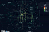
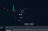
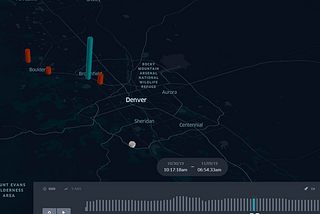
Abdullah KurkcuinTowards Data ScienceVisualizing Bus Trajectories in DenverUsing Python and Unfolded to visualize RTD’s real-time bus data feedsFeb 25, 2021Feb 25, 2021
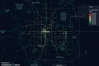
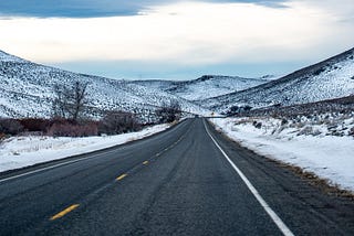
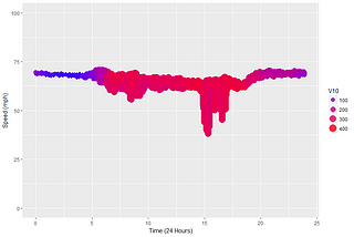
Abdullah KurkcuinTowards Data ScienceImpact of Snow on Road Traffic Operations: Case Study -State Highway 285Hello everyone,Dec 2, 20201Dec 2, 20201
Abdullah KurkcuinAn Idea (by Ingenious Piece)Bike Ridership Before/After COVID in ColoradoHello,Aug 28, 2020Aug 28, 2020
Abdullah KurkcuDownloading and Visualizing Denver Bike and Ped Data with Python and Kepler.glHello everyone,May 8, 2020May 8, 2020
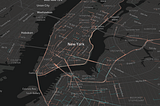
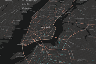
Abdullah KurkcuinBetter ProgrammingPlaying With Uber’s Hexagonal Hierarchical Spatial Index, H3NYC taxi data visualizationDec 18, 20193Dec 18, 20193
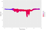
Abdullah KurkcuCreating Smooth Animations in R with tweenr (Traffic Speed Data)While looking for libraries to create animated plots, I found this gem. I thought this was new but it looks like it s been there for a…Feb 14, 20181Feb 14, 20181
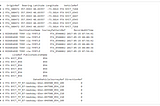
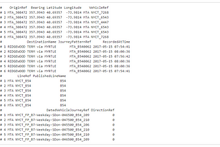
Abdullah KurkcuCreating a 3D Time-Space Diagram using R— MTA BusTime DataLet’s first load the library we are going to use in R.Feb 6, 2018Feb 6, 2018