PinnedAbdullah KurkcuinTowards Data ScienceCreating a Gantt Chart with PowerBIAfter failing many times to create a Gantt Chart using existing visuals, I decided to build one myself using a matrix visual in PowerBI.·7 min read·Nov 11, 2022----
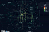
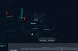
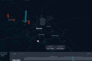
Abdullah KurkcuinTowards Data ScienceVisualizing Bus Trajectories in DenverUsing Python and Unfolded to visualize RTD’s real-time bus data feeds·4 min read·Feb 25, 2021----
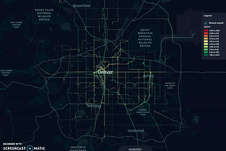
Abdullah KurkcuinTowards Data ScienceImpact of Snow on Road Traffic Operations: Case Study -State Highway 285Hello everyone,·4 min read·Dec 2, 2020--1--1
Abdullah KurkcuinAn Idea (by Ingenious Piece)Bike Ridership Before/After COVID in ColoradoHello,·2 min read·Aug 28, 2020----
Abdullah KurkcuDownloading and Visualizing Denver Bike and Ped Data with Python and Kepler.glHello everyone,·4 min read·May 8, 2020----
Abdullah KurkcuinBetter ProgrammingPlaying With Uber’s Hexagonal Hierarchical Spatial Index, H3NYC taxi data visualization·4 min read·Dec 18, 2019--3--3
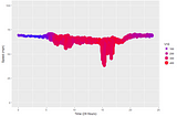
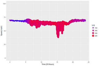
Abdullah KurkcuCreating Smooth Animations in R with tweenr (Traffic Speed Data)While looking for libraries to create animated plots, I found this gem. I thought this was new but it looks like it s been there for a…3 min read·Feb 14, 2018--1--1
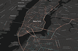
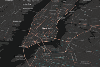
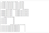
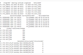
Abdullah KurkcuCreating a 3D Time-Space Diagram using R— MTA BusTime DataLet’s first load the library we are going to use in R.2 min read·Feb 6, 2018----